As the lead designer for this project, I:
- Crafted the visual and interaction design for all the out of session experience. (This project was then transitioned over to a team based on Bangalore, and I collaborated with the lead designer there for the in session experience).
- Collaborated with user research team on multiple rounds of usability testing.
- Worked closely with developers as they implemented designs in an agile environment.
My Computers Screen
The most important screen for GoToMy PC is My Computers. This screen displays all of the computers on the account that the user has configured for remote connection and, when a user logs into the product, they are taken here first. Traditionally, we've displayed those computers in a list format.
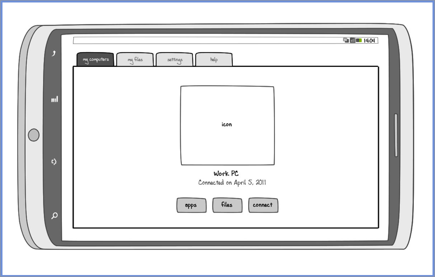
Wanting to know a little more about that, I asked the product team what the average number of computers on an account: just a little over 1 computer was the answer. As you can imagine, a list view isn't the most optimal way to display this information. To address this inefficiency, I proposed the icon view shown below. While more visually appealing, it also allows extra space for dates, computer states (there are at least 8 separate states computer can be in) and other information. When there are more than three computers on the account, a small portion of one is visible from the right of the screen, introducing affordance for the user to naturally swipe to reveal more.
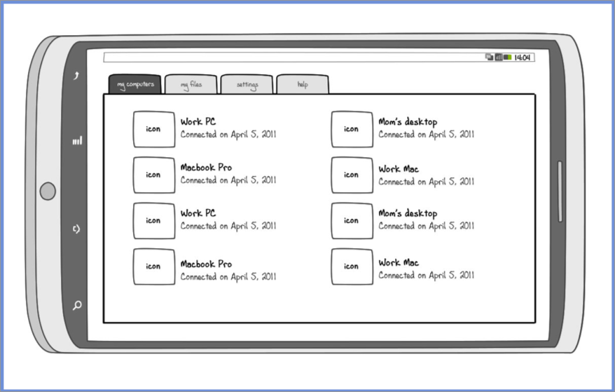
We did keep the list view (see below), especially helpful for those small subset of users and most administrators who manage tens of computers.
Wireframes
I put together initial wireframes to understand technical possibility and constraints, as well as obtain product team buy-in on the proposed user experience. Once the team felt comfortable moving forward with the wireframes, we proceeded to high-fidelity mockups with a plan to conduct multiple rounds of usability testing.
Final Designs
My Computers Screen, Icon View. Based on data that verified most users had no more than 2 computers in their account, I designed a display that was more visually compelling than the standard list view.
My Computers Screen, List View. We did keep the list view available, which is a more optimal user experience for accounts with many computers.
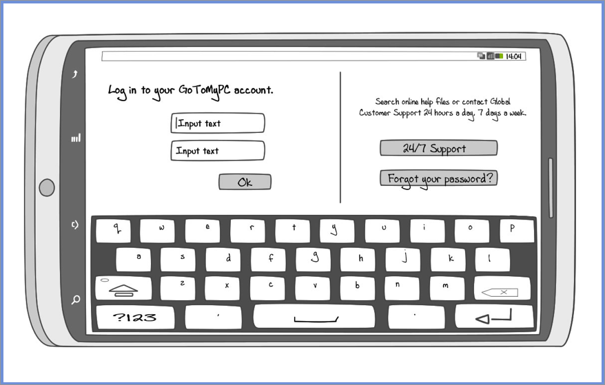
Login Screen. Users are able to log into the app with their GoToMyPC credentials. New users can navigate to the account creation webpage when they tap on the "Try It Free" button.